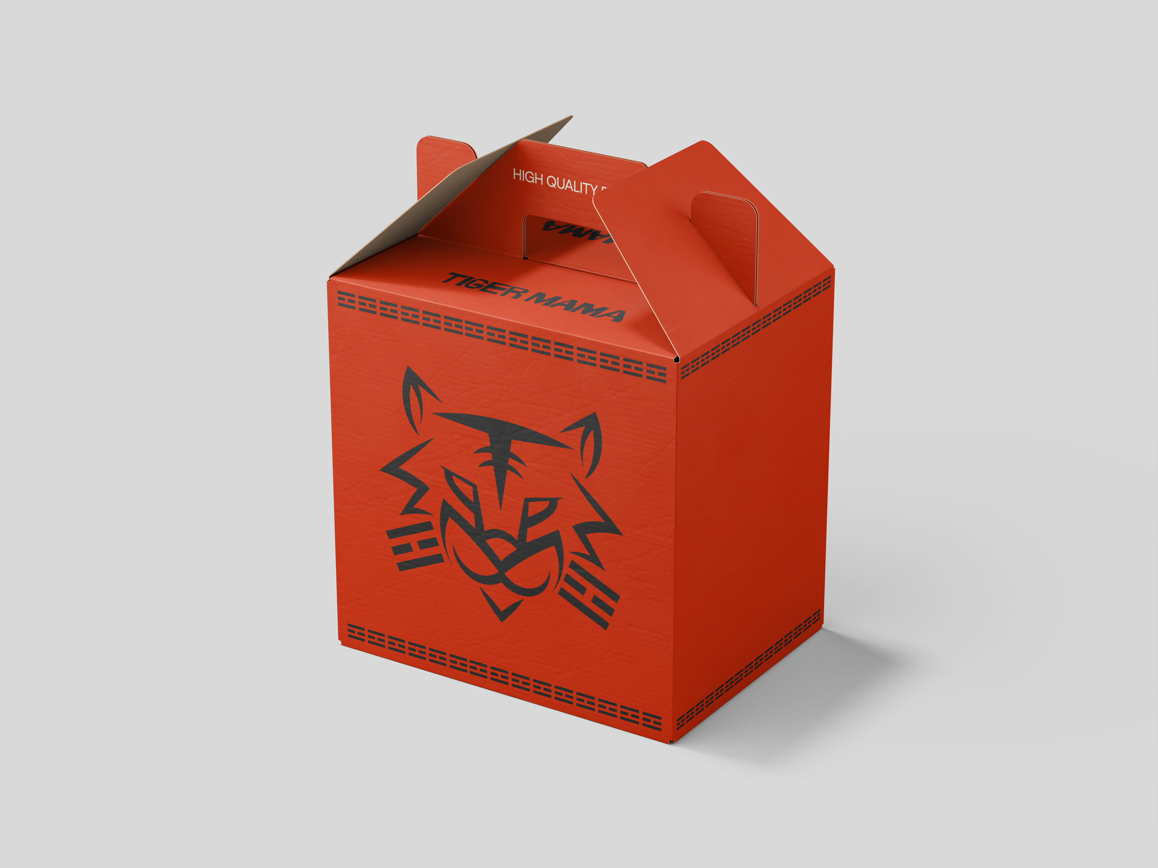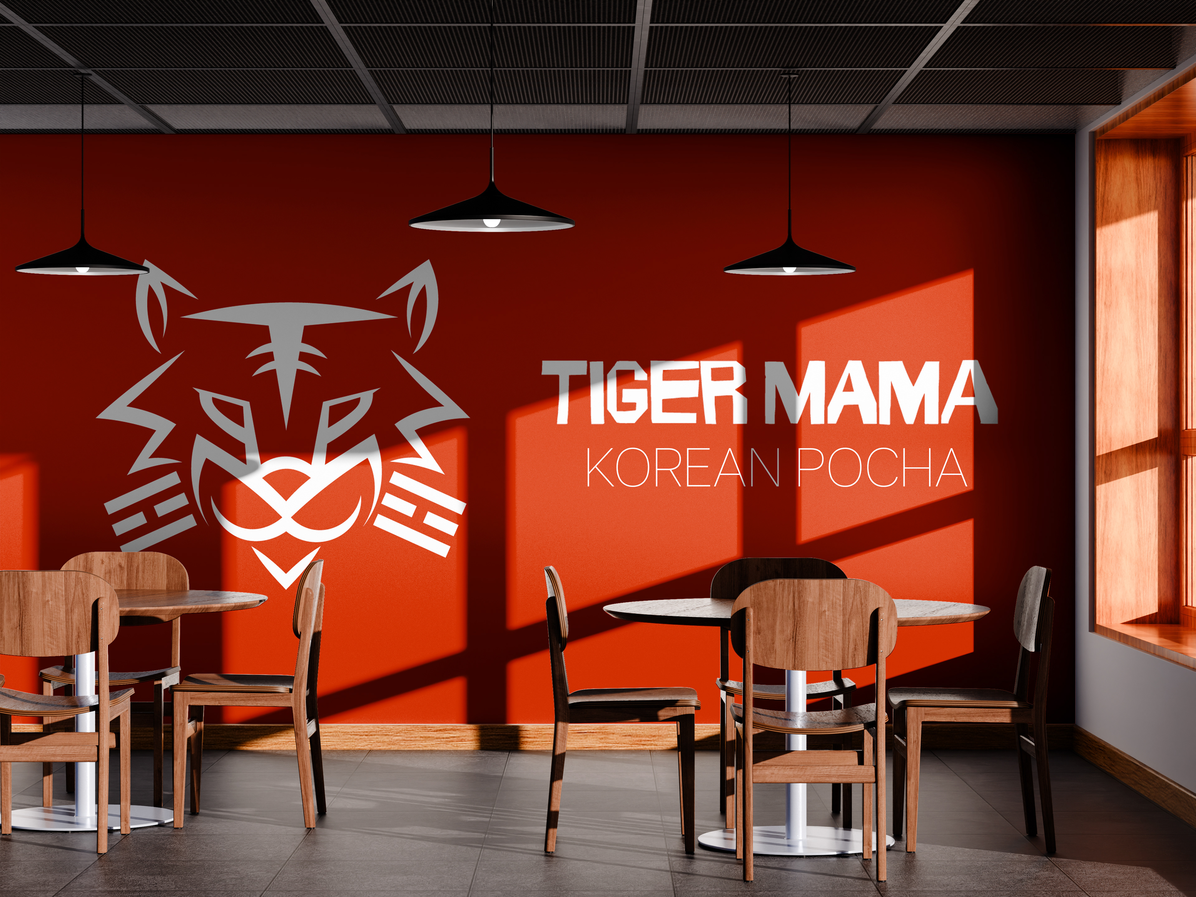
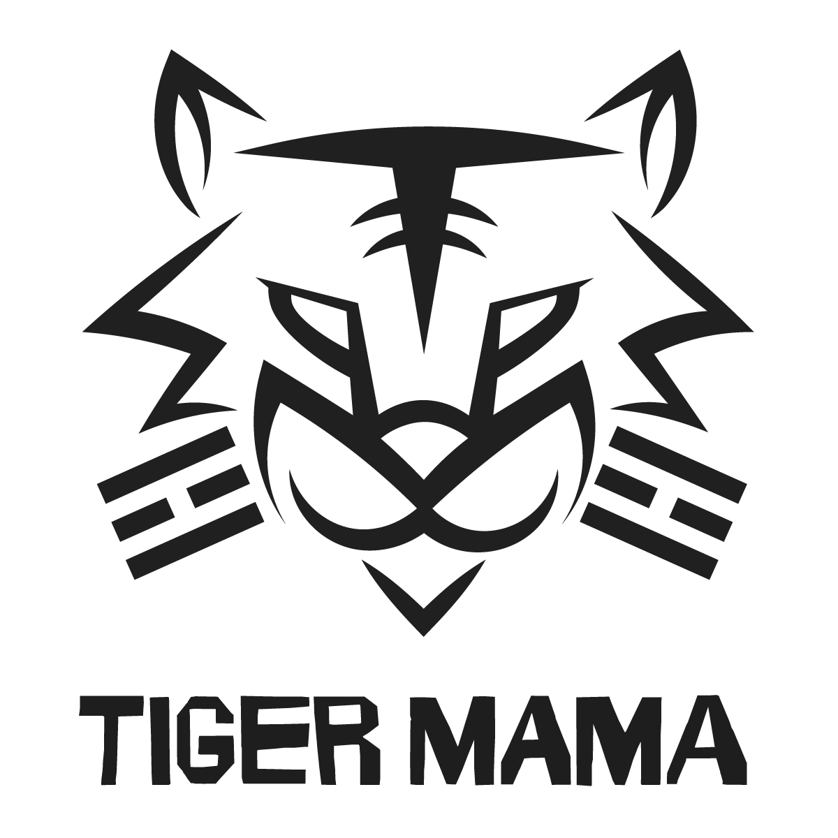
As a rebrand project, I decided to create a new logo and visual identity for a local Korean restaurant.
Infused with purpose and meaning, telling the story of a brand and its family recipe.
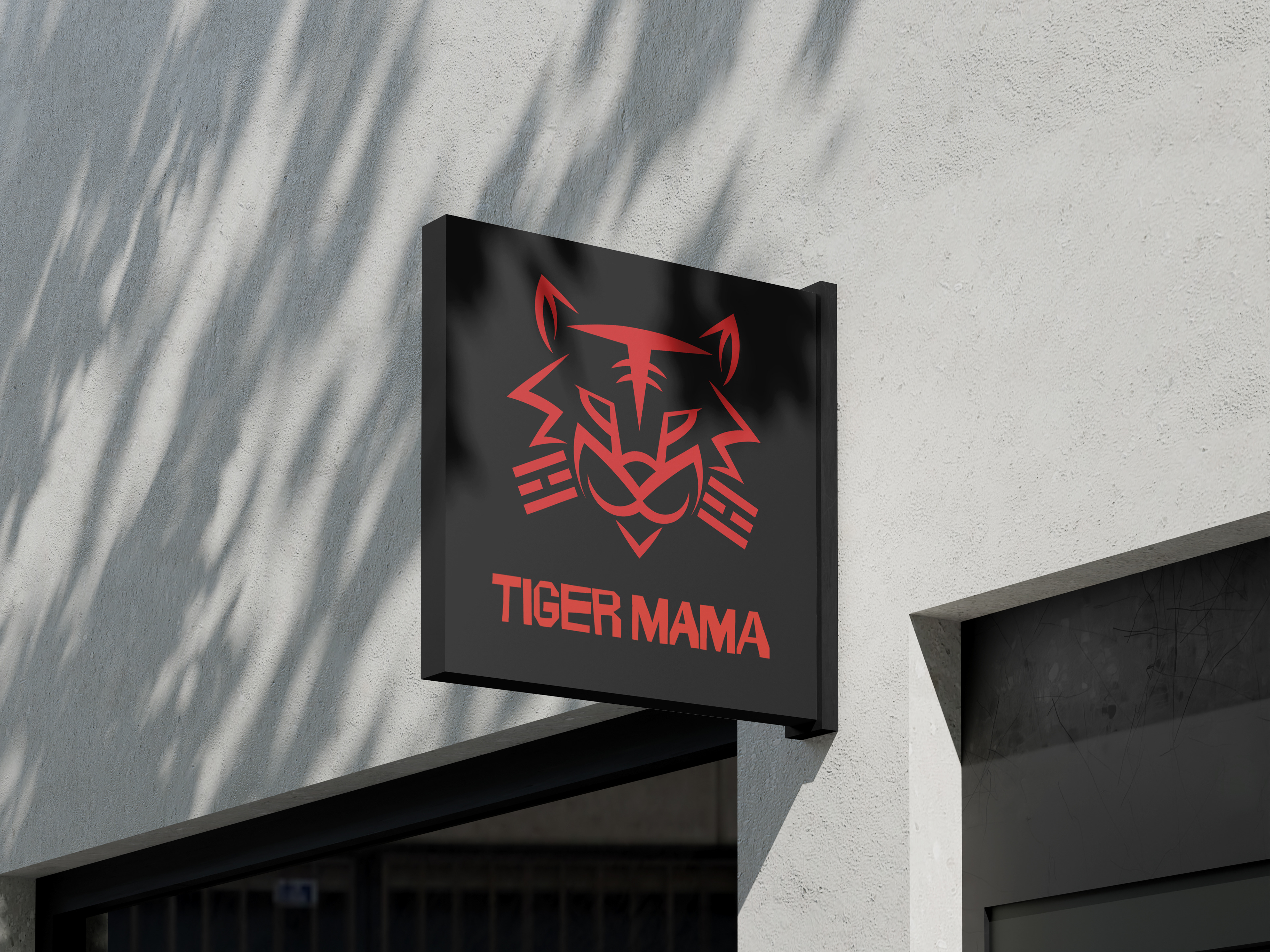
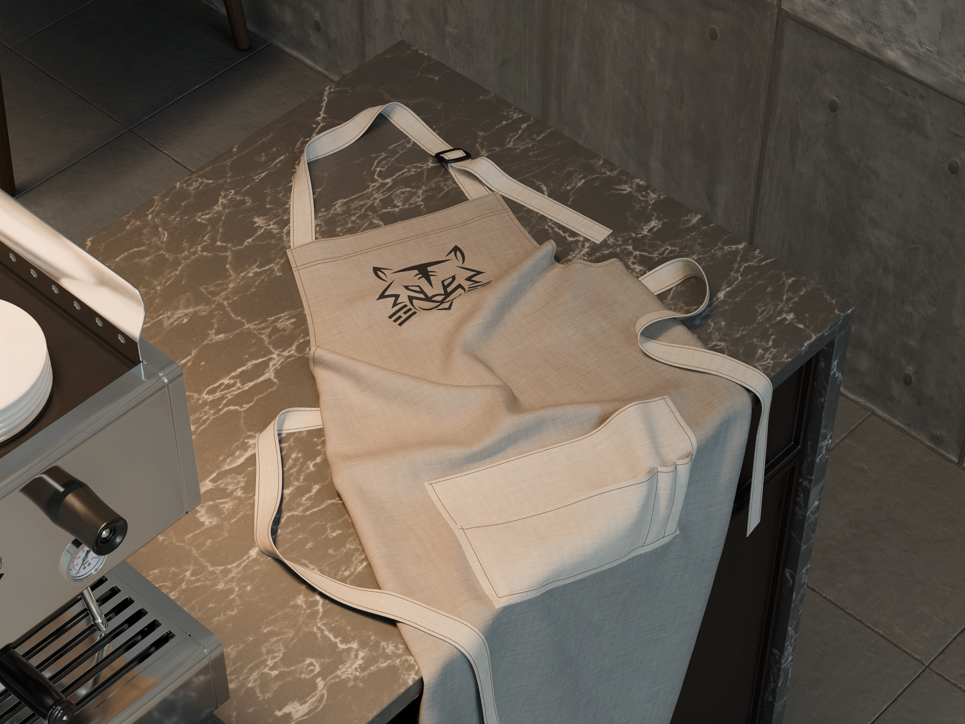
The logo has subtle symbolism as the tiger face is shaped my a 'T' and the top, and a 'M' for 'Mama' for the snout.
Along with this, the tiger's whiskers are pulled from one of the four symbols on the Korean flag. this one representing fire, symbolizing the flames of cooking and spices found in Korean dishes.