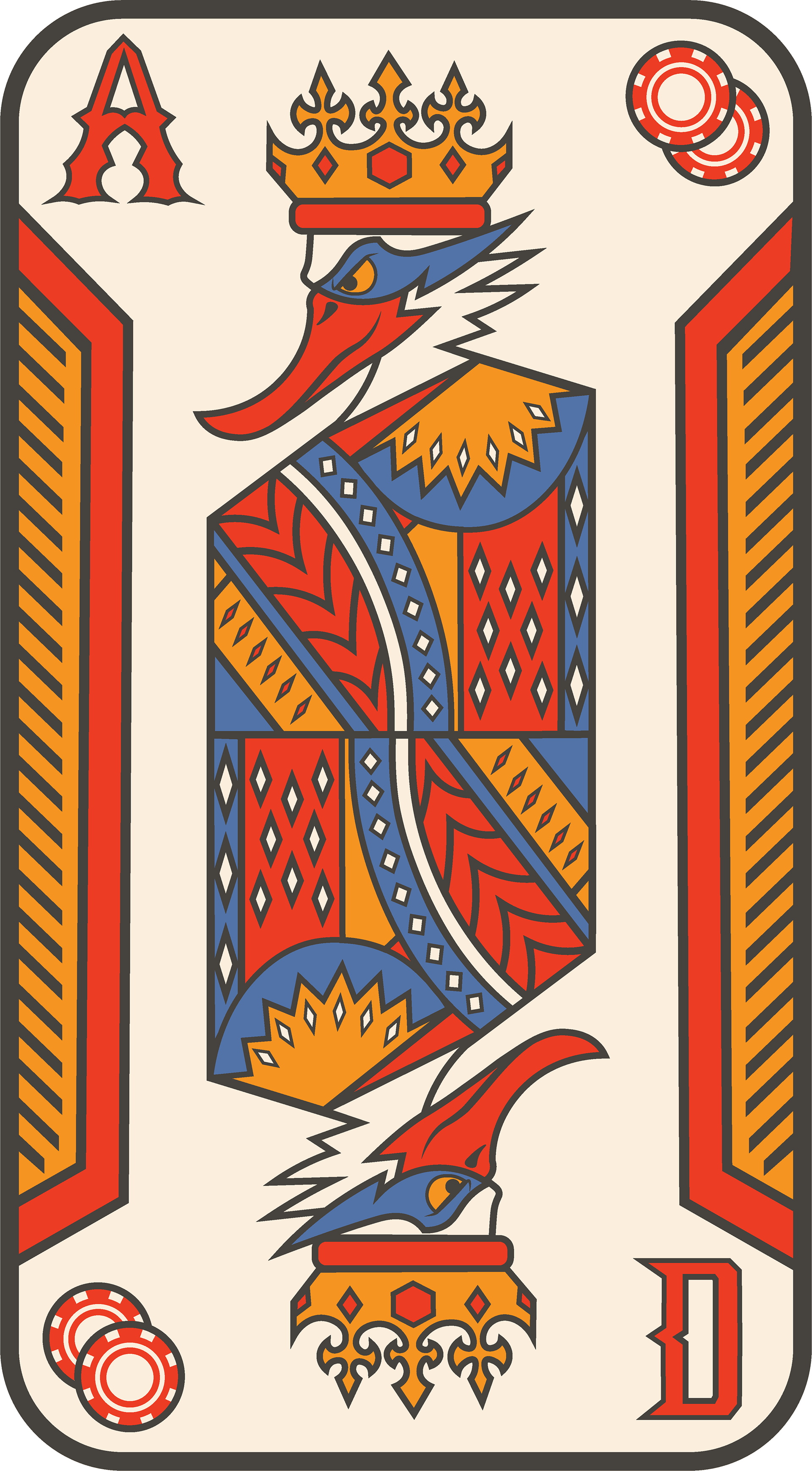
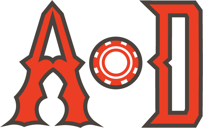
Ace of Ducks
BRANDING
CREATIVE BRIEF
Build a visual brand identity that is timeless, clean, and modern.
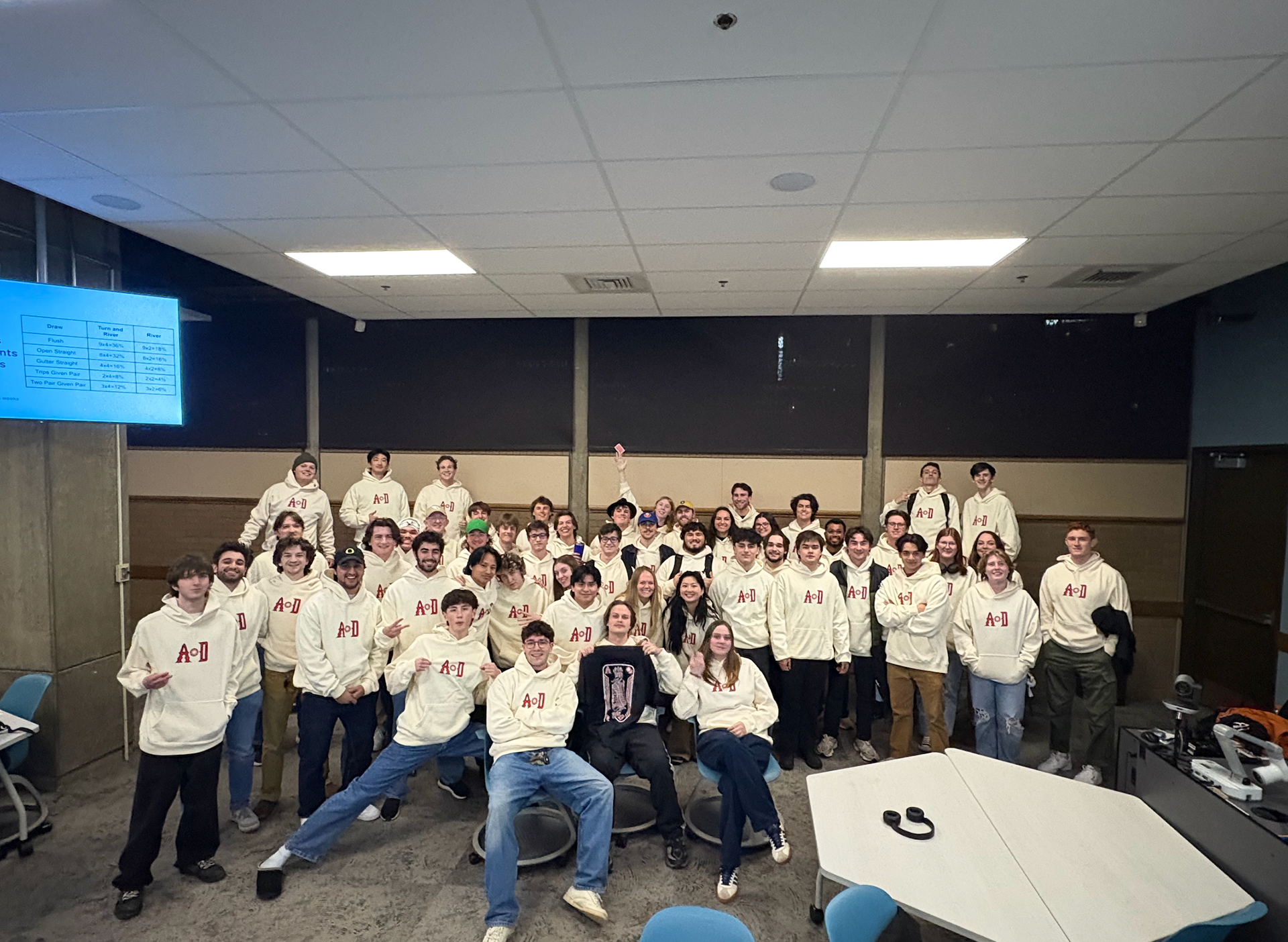
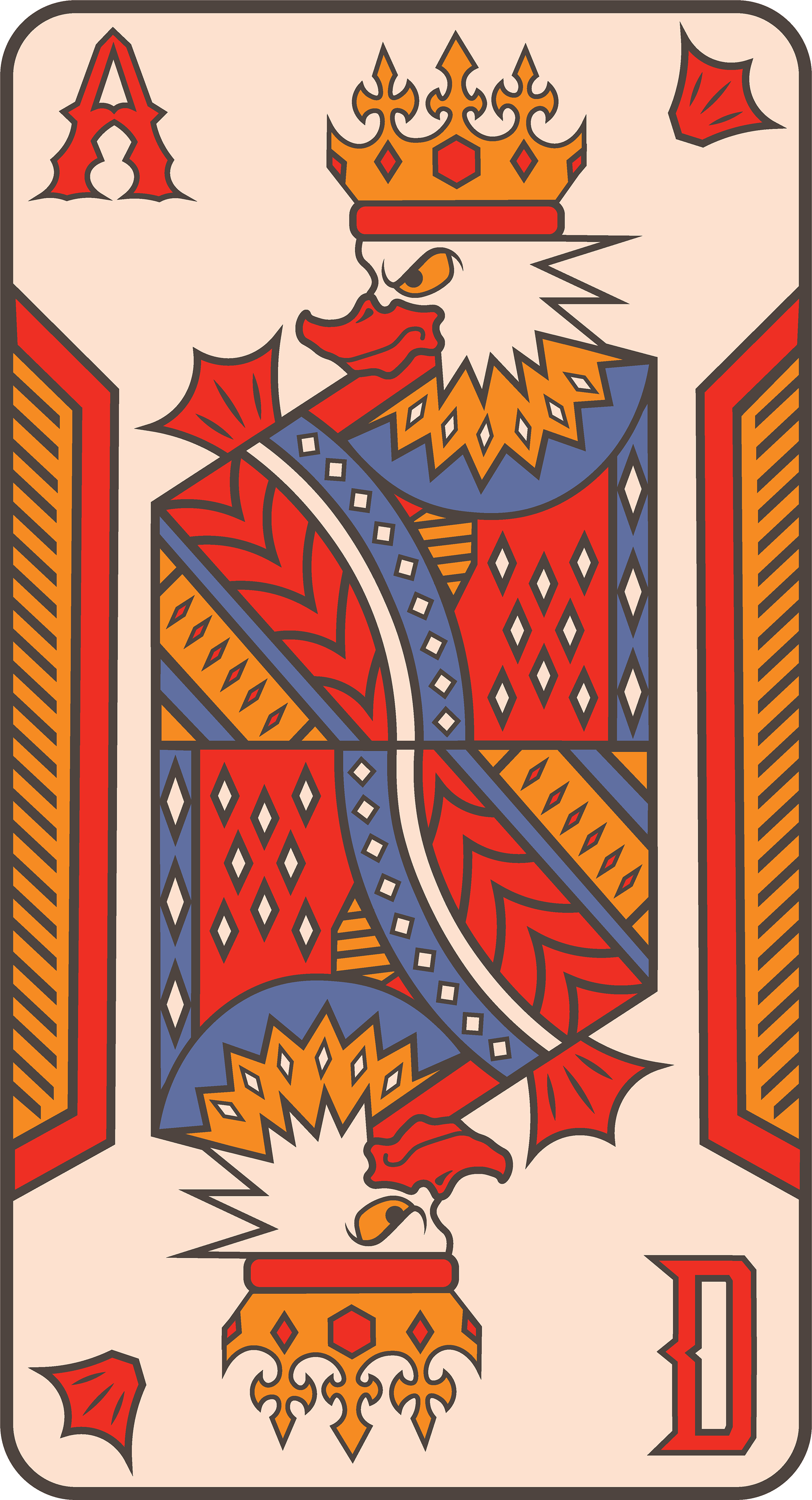
Project designed for the University of Oregon's Poker Club, Ace of Ducks.
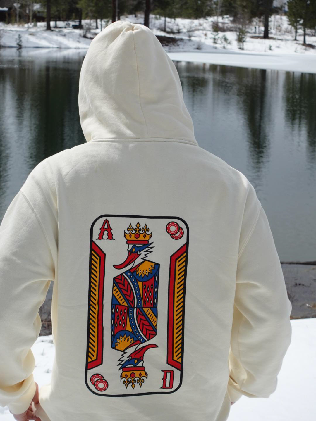
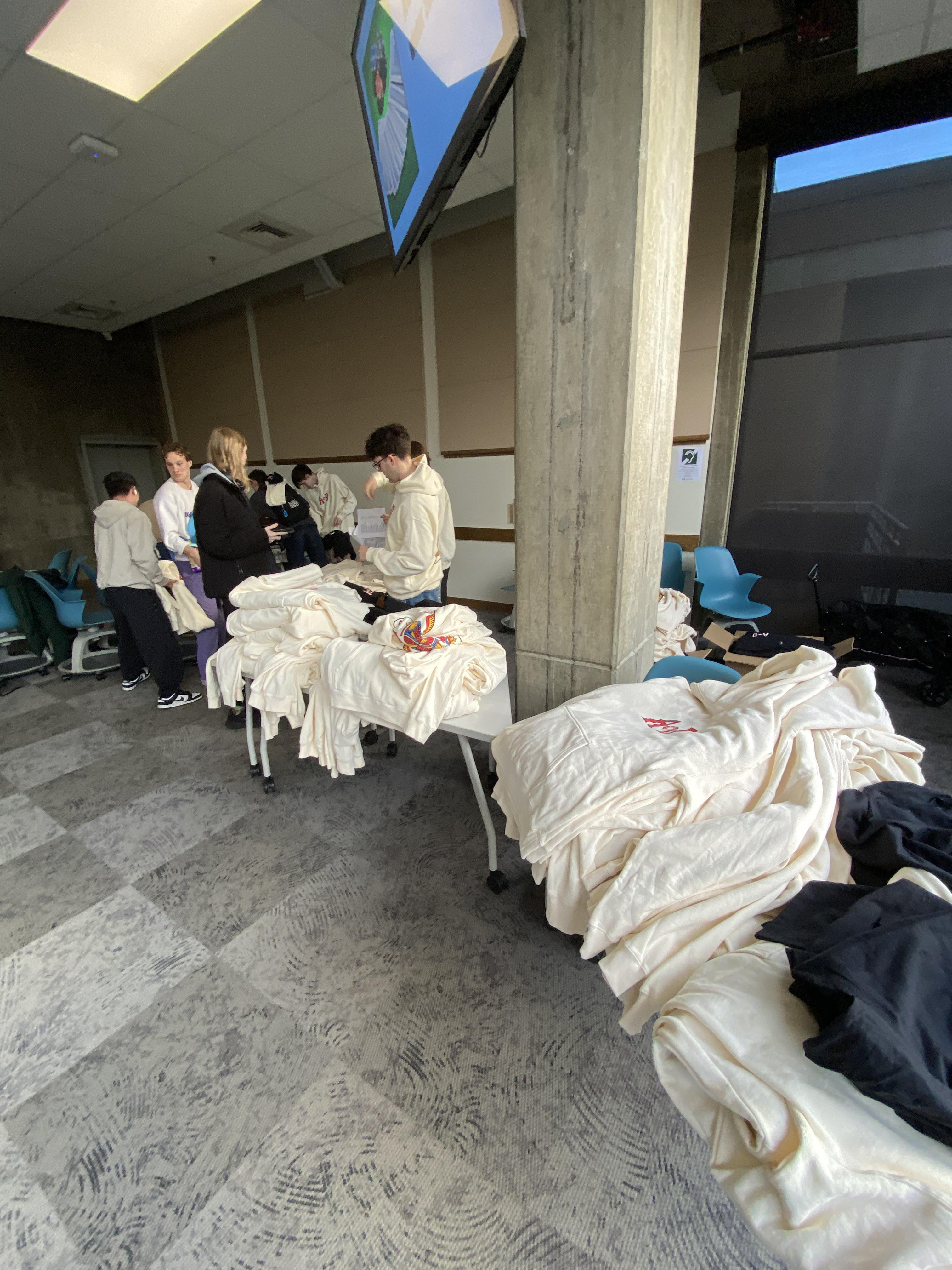
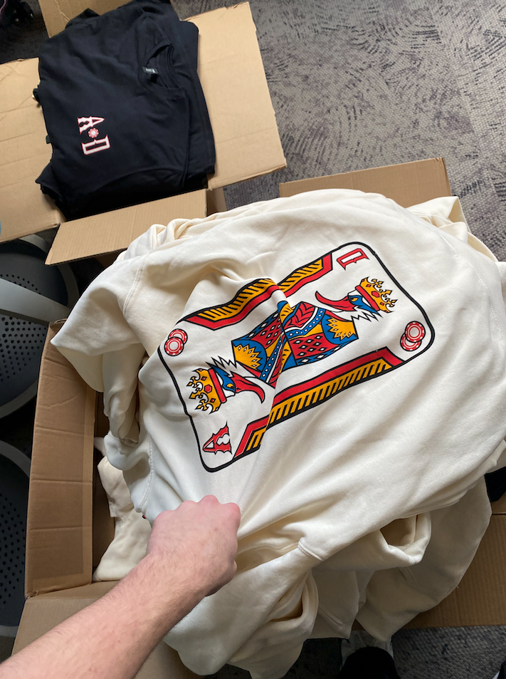
Led creative direction, created deliverables such as logo, set of custom cards, and printed hoodies and t-shirts for the club.


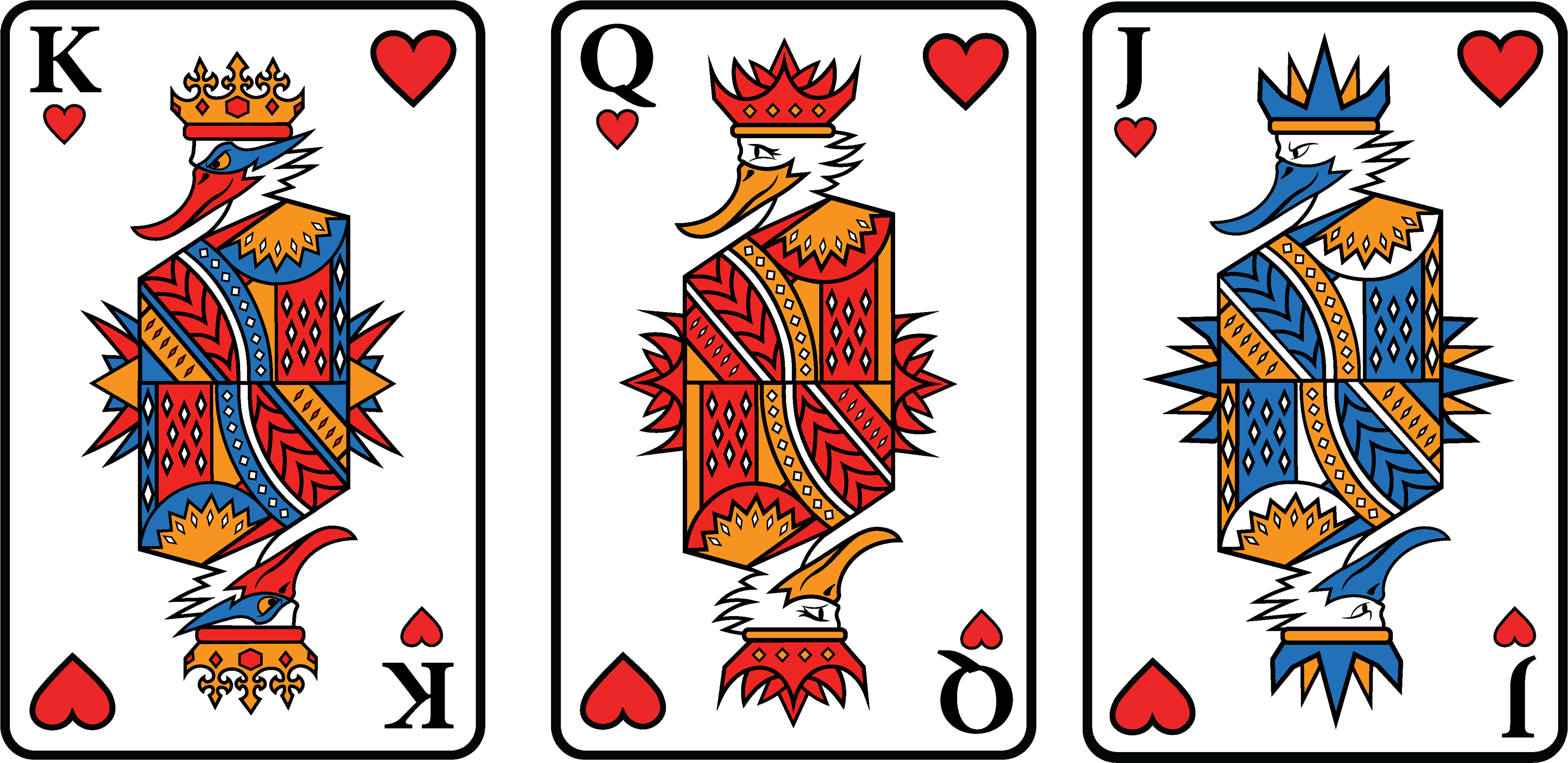
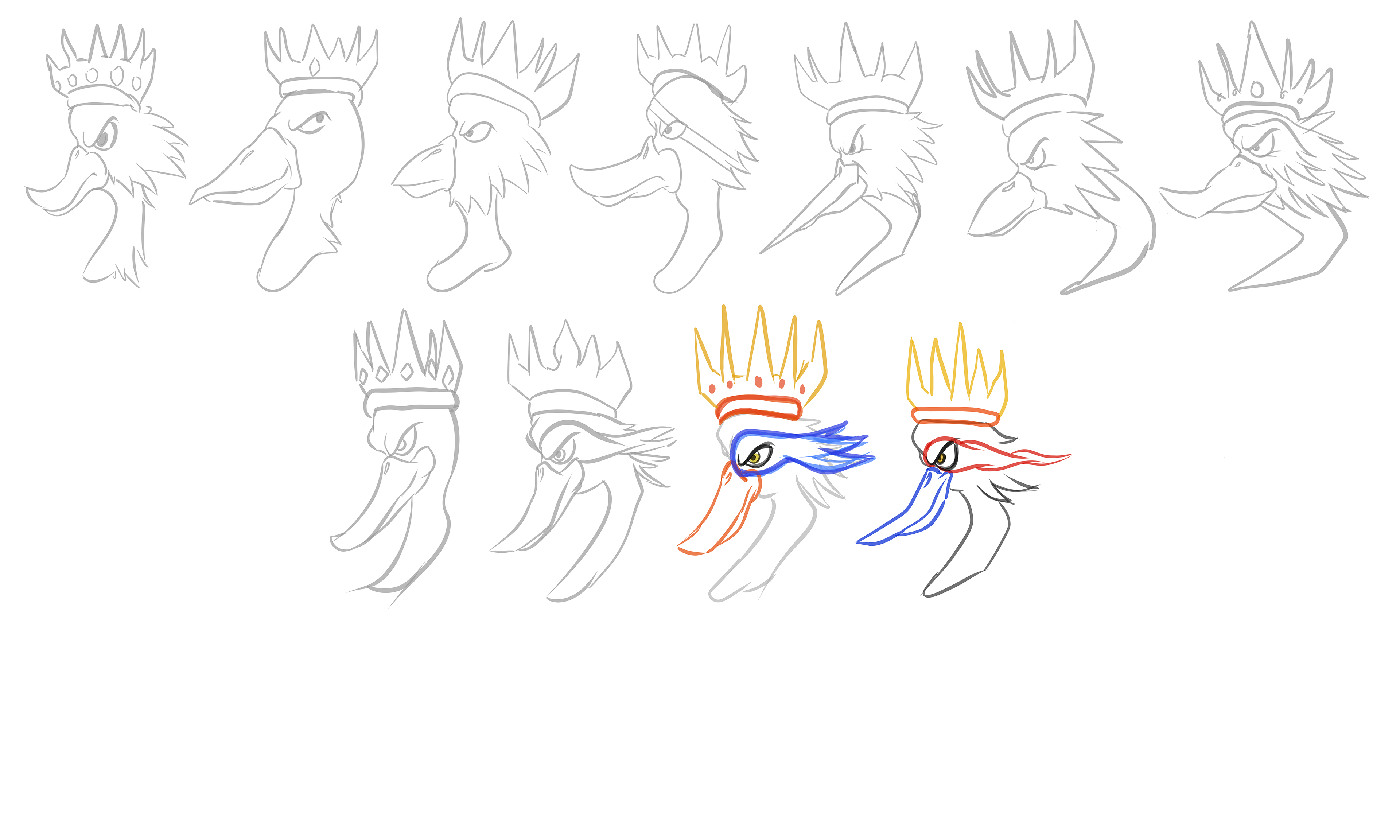
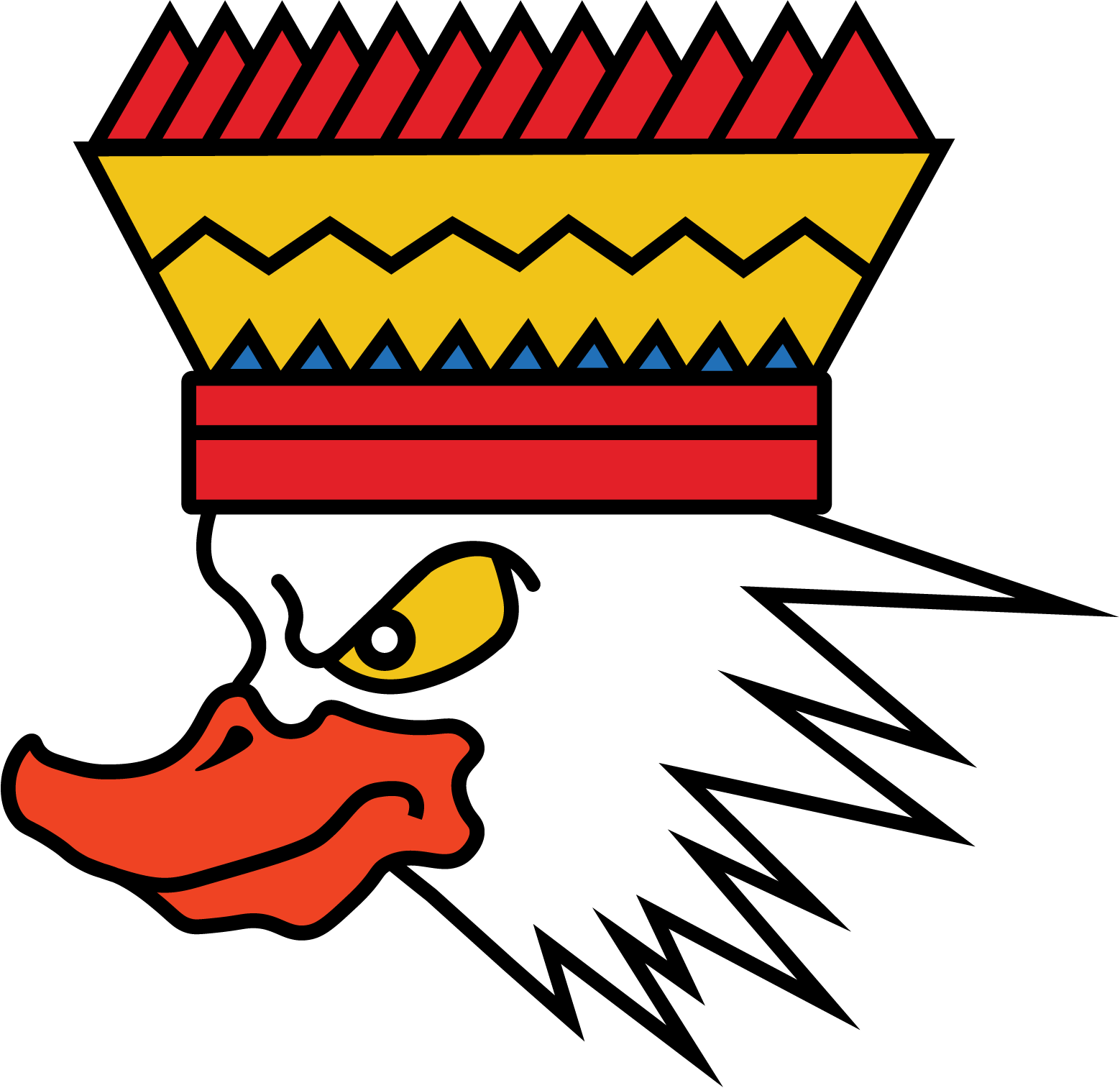
After several meetings with University of Oregon Branding, the use of a duck was prohibited. I turned to the drawing board to create the royal heron, a staple of Eugene wildlife.
DUCK CARD BEFORE UO BRANDING CHANGE
IDEATION STAGE
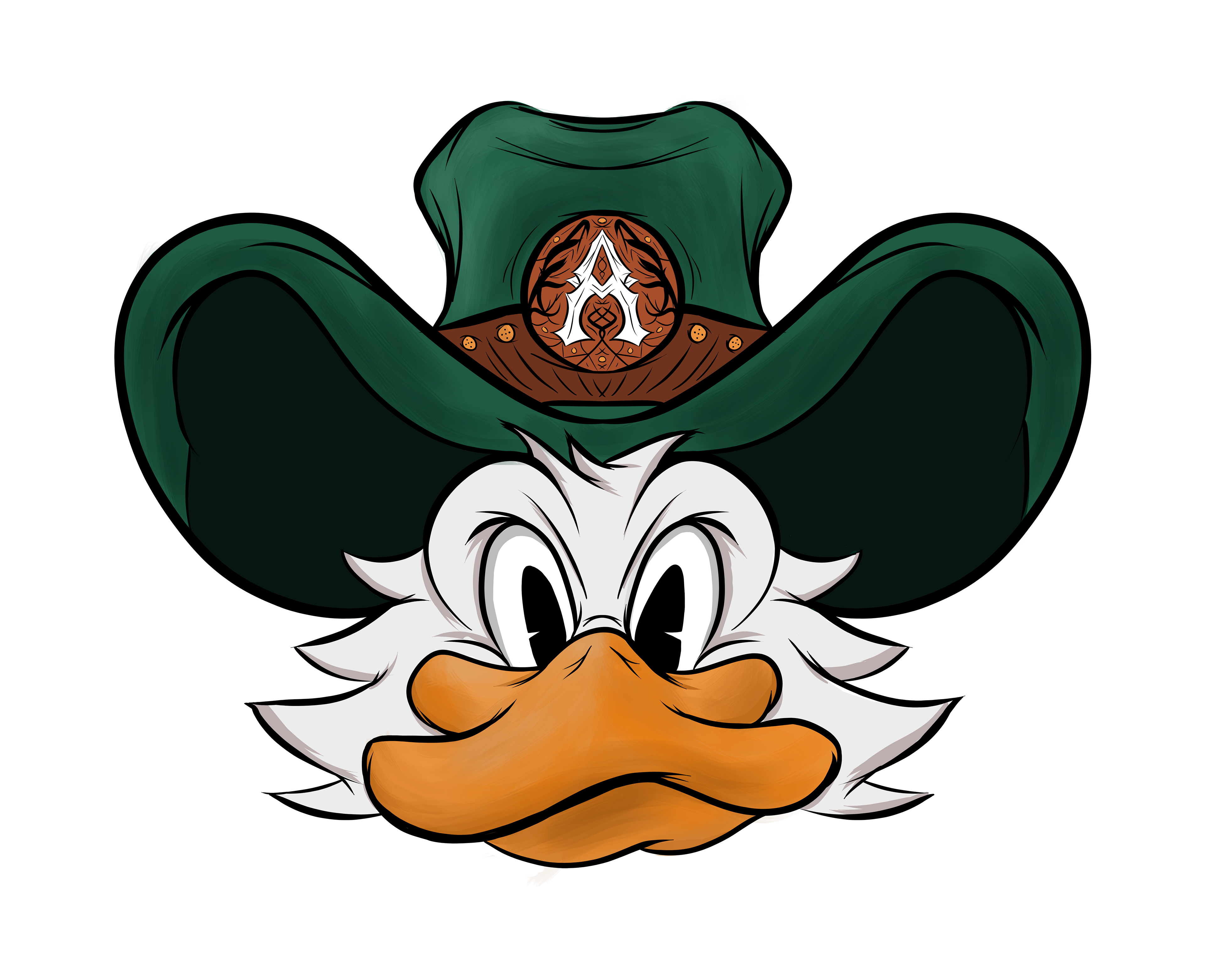

DESIGN ETHOS
I chose a vintage cream background and tint to the official design to add a nostalgic flavor and soften the saturation of each color.
The heron needed to be elegant and bold, with a confident game face, ready for the table, representing the game of poker and the Ace of Ducks club.
The heron is a stoic creature, suited for a game of pressure that asks players to hide their hand and strategy.
HERO ART/MERCH DESIGN

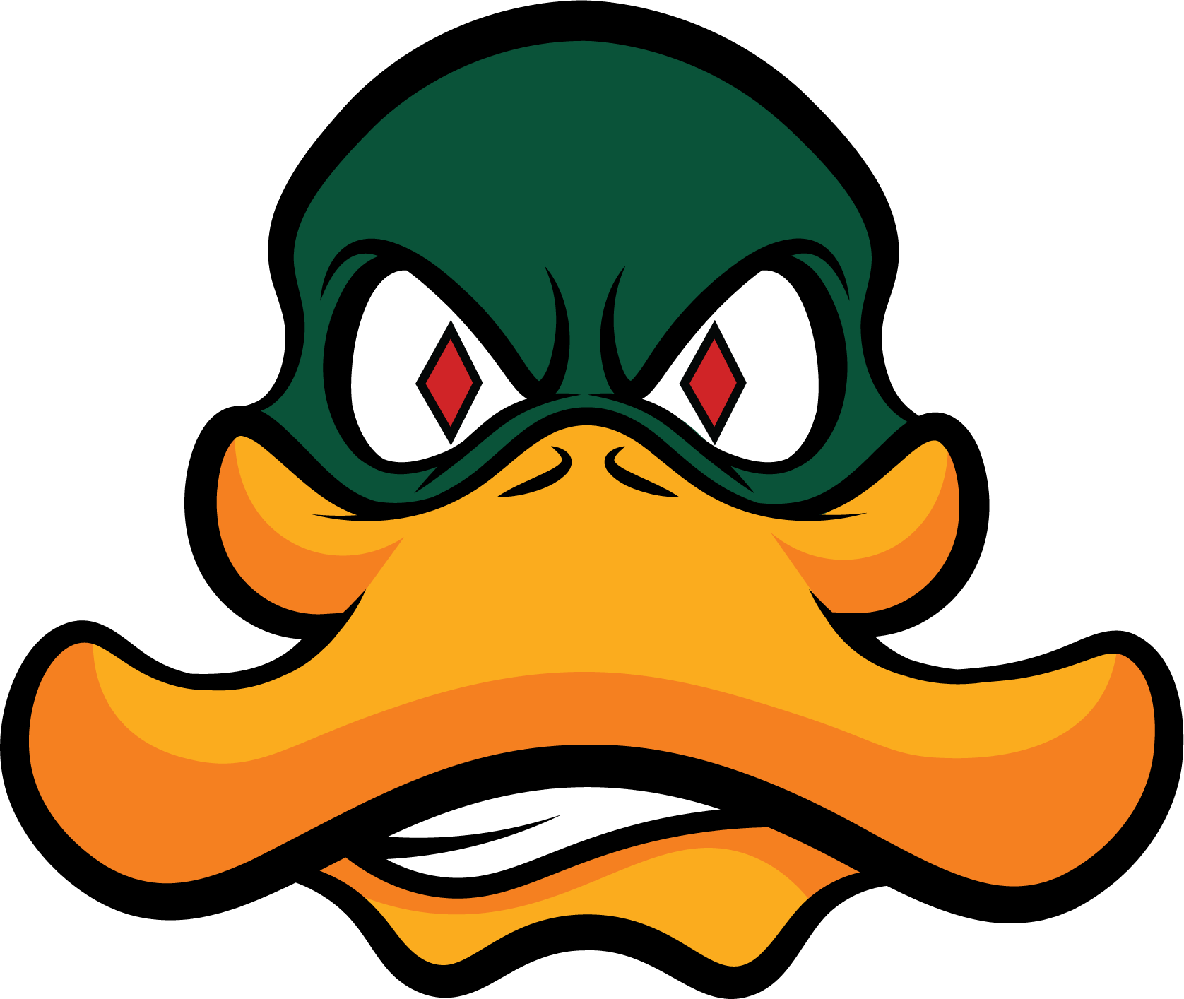
WEBFOOT 'A' ICON AND LOGO
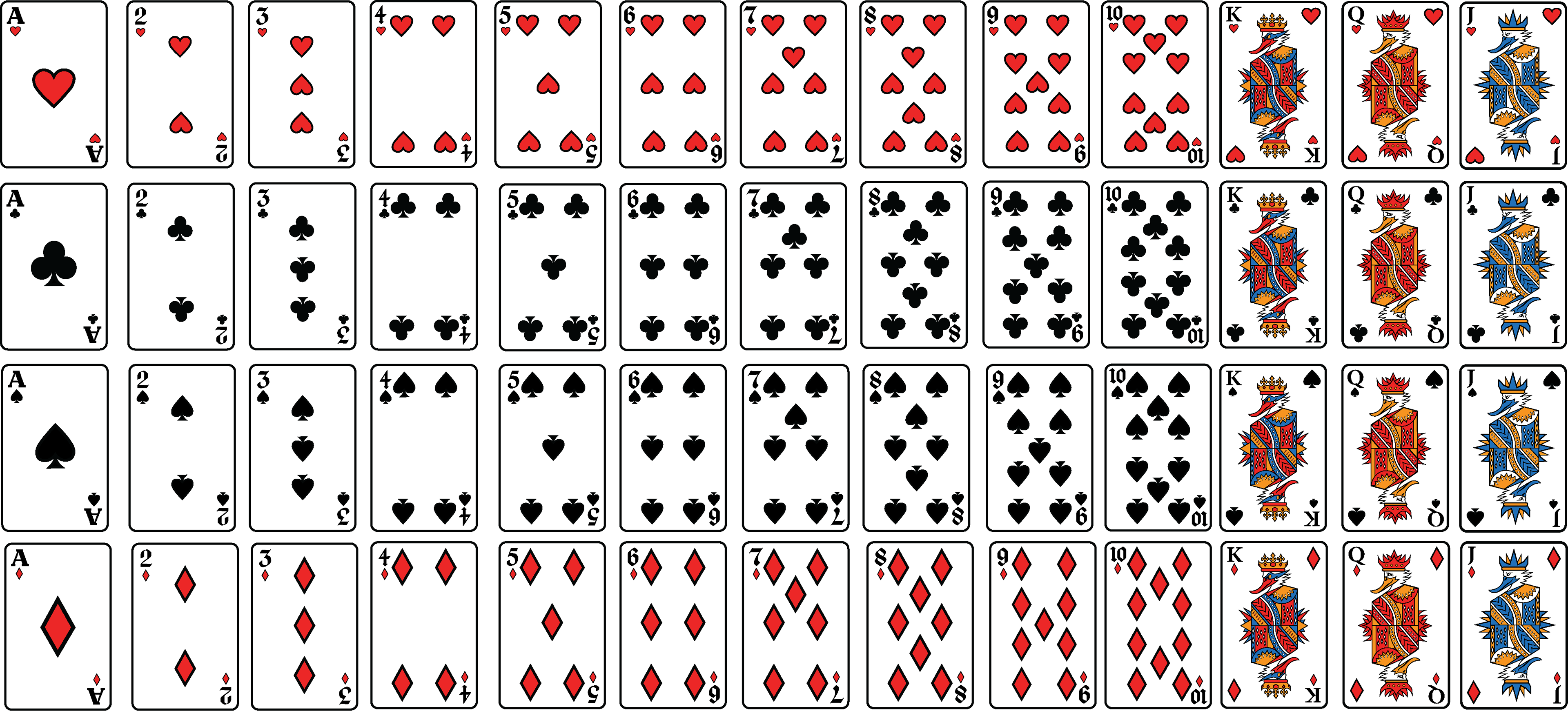
CUSTOM CARD SET